Curaplex® is the house brand of Bound Tree Medical, a medical supplies distributor for Fire and EMS agencies. Curaplex offers Bound Tree customers the best pricing, availability, selection, and quality in medical products, but customers weren't always aware of the advantage Curaplex was to their business. Our marketing leaders created new positioning for the brand, and it was up to me (with help from my team) to execute unique creative to accentuate the new positioning.
Brand Poster
The brand poster is used as a quick reference for different elements of the brand, so that all designers can be aligned and consistent in working with the updated creative. The colors are inspired by the flashing and blurring of blue and red lights from police, fire, and EMS vehicles at the scene of an emergency. The roundness of the button and icon elements reflects back to the round dots and the curve of the "c" in the previously established Curaplex logo.
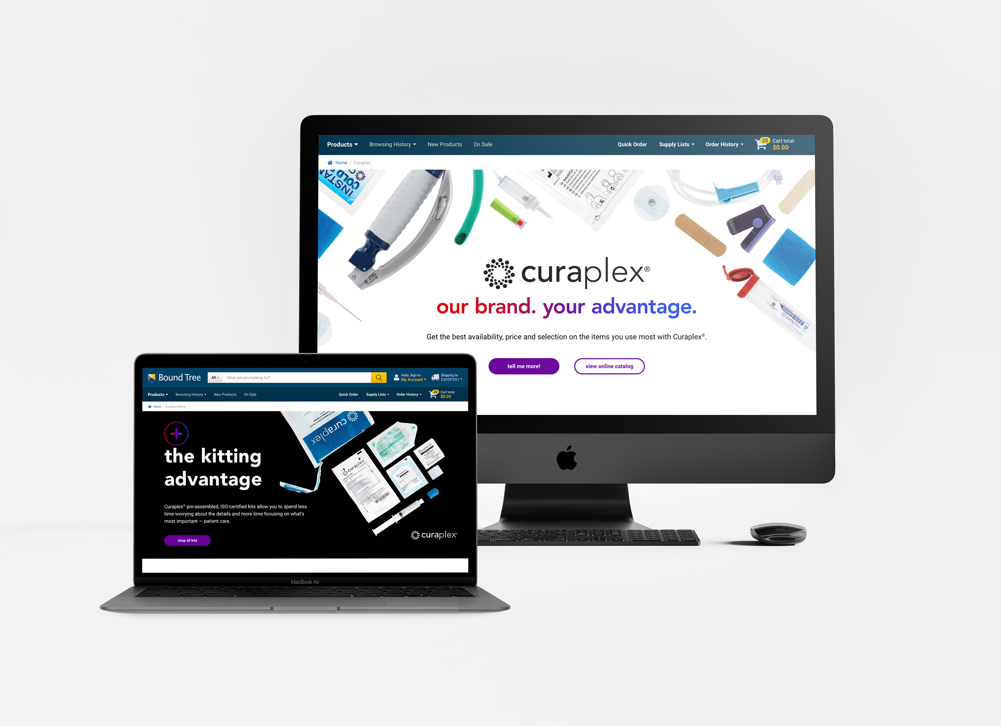
Trade Show Booth Design
This trade show booth display fits in a 10ft x 10ft space on the show floor. Each banner is 8ft tall. The Curaplex team needed their booth to highlight both the overall brand messaging and the unique advantage that kitting offers. The thing I love the most about this booth display is that it puts the products front and center in a way that is beautiful yet informative.
Email Designs
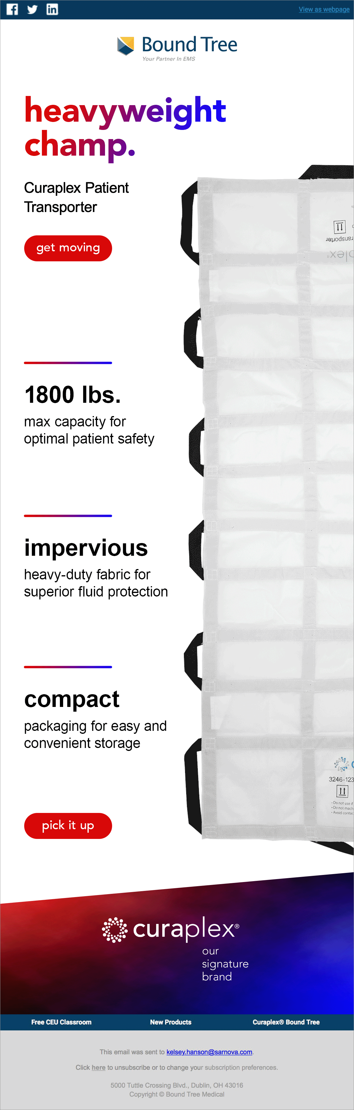
Email marketing is one of the best ways to show off the personality I created for Curaplex. Using witty, all lowercase headlines and playful product GIFs shows off the fun, clever, and friendly aspects of the brand.
Through the creation of these email designs, I found that copywriting spunky headlines was a strength of mine. I also discovered that words and feelings inspire me the most when I create new branding.
(Left): A fun way to incentivize scrolling through a lot of content. With this design, I was able to zoom in on the wound care products and show off their textures, adding visual interest.
(Middle): The hero GIF adds a spark of fun while also showing off the tamper-proof packaging and convenience kits provide.
(Right): The GIF leads the eye down the page, reversing direction on the point about the compactness of the product while the GIF is in the most compact position.
Landing Page Designs
With the updated brand look, I also needed to update the look of our Curaplex landing pages, one for Curaplex overall and another for Curaplex Kitting.
I kept the pages simple, with only a few background transitions so customers scrolling through the page wouldn't get too distracted. I made the CTAs consistently purple so that the buttons would not be competing with some of the red product photos.
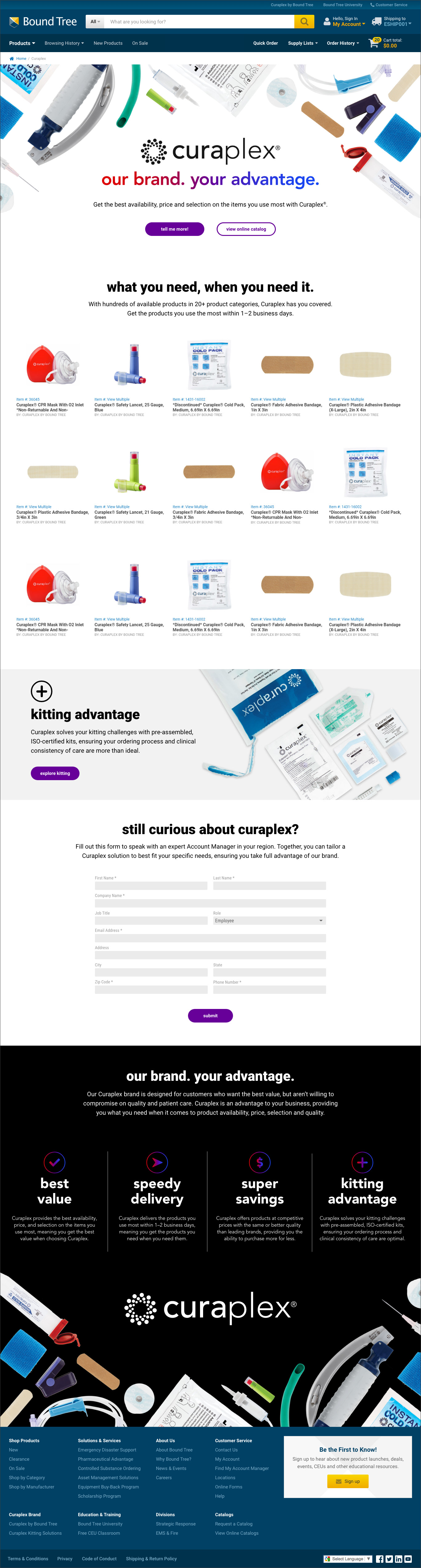
Curaplex Landing Page Design
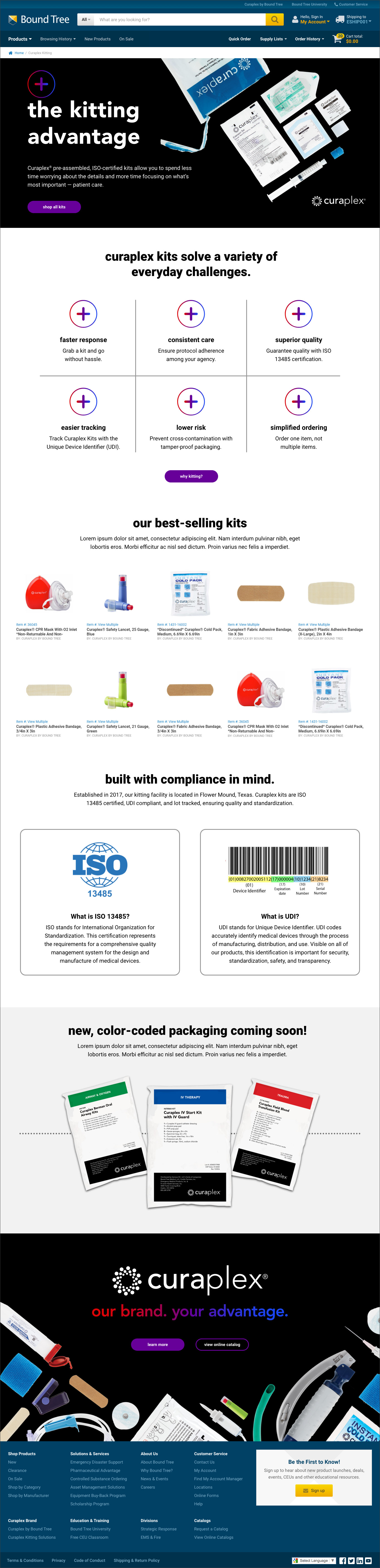
Curaplex Kitting Landing Page Design
Website Subcategory Banners
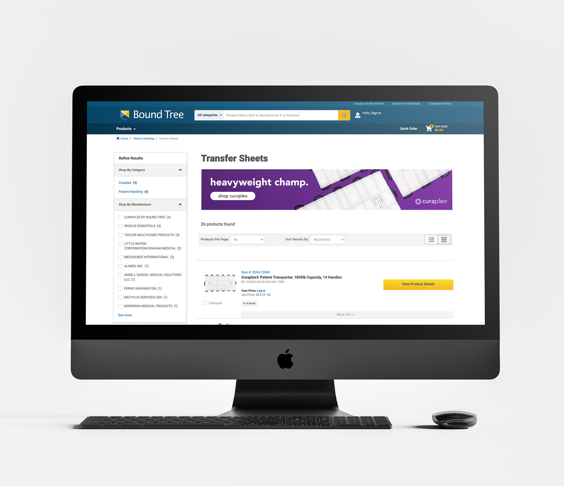
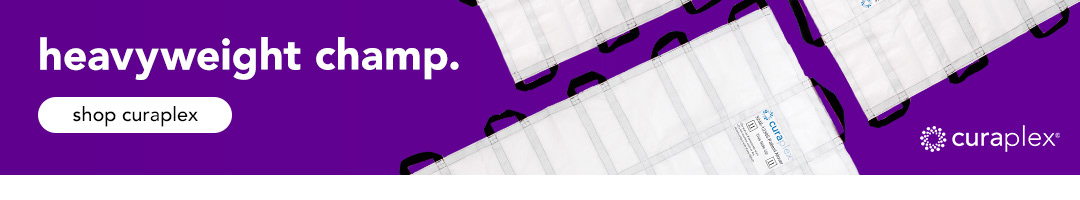
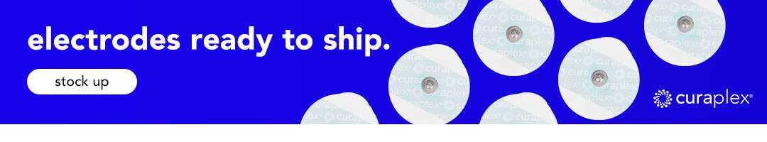
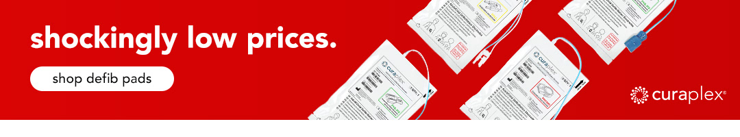
To create more visibility for Curaplex on boundtree.com, I created subcategory banner designs, which would drive more traffic to Curaplex product pages. They are strikingly simple.